If you use Tumblr on a web browser, you might have noticed us testing a brand new navigation on your dashboard in the last month. Now, after some extensive tweaks, we’ve begun rolling out this new dashboard navigation to everyone using a web browser. Welcome to the new world. It’s very like the old world, just in a different layout.
Why are we doing this? We want it to be as easy as possible for everyone to understand and explore what’s happening on Tumblr—newbies and seasoned travelers alike.
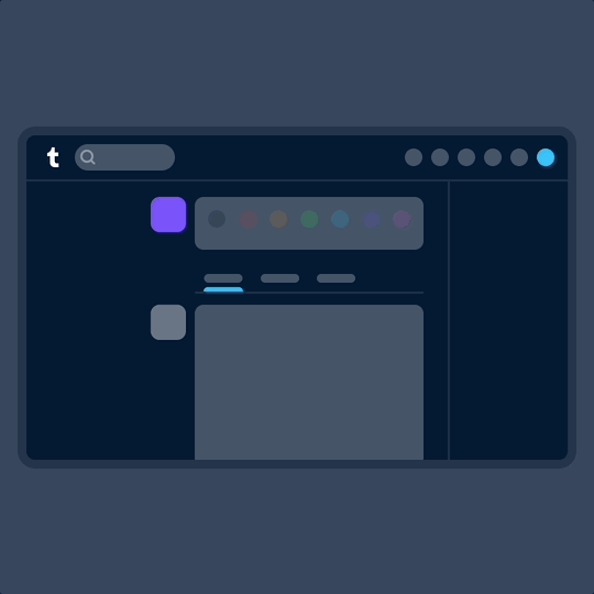
Labels over icons: When adding something new to Tumblr in the past, we’d simply add a new icon to our navigation with little further explanation. Turns out no one likes to press a button when they don’t know what it does. So now, where there’s space, the navigation includes text labels. Since adding these, we’ve noticed more of you venturing to previously unexplored corners of Tumblr. Intrepid!
What’s already been fixed? Thanks to feedback from folks during the testing phase, we’ve been able to make some improvements right out of the gate. Those include returning settings subpages (Account, Dashboard, etc.) to the right of the settings page instead of having them in an expandable item in the navigation on the left; fixing some issues with messaging windows on smaller screens; and streamlining the Account section to make it easier to get to your blogs.
What’s next? We’re looking into making a collapsible version of this navigation and improving the use of screen space for those of you with enormous screens. We’re also working on improving access to your account and sideblogs.
That’s all for now, folks. For questions and suggestions, contact Support using the “Feedback” category. Please select the “Report a bug or crash” category on the support form for technical issues. And keep an eye out for more updates here on @changes.
This is terrible and for everyone who wants to unfuck it: