Draecember day 2
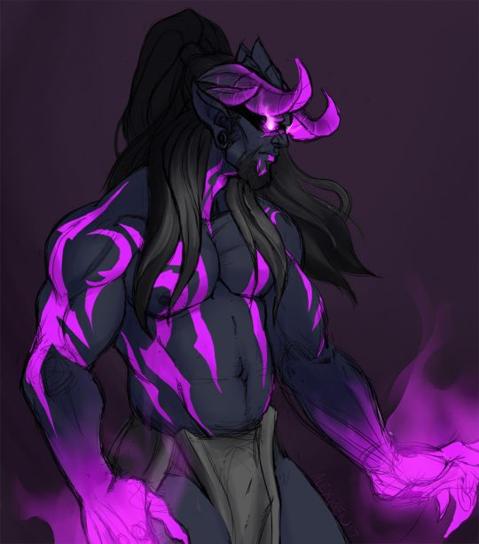
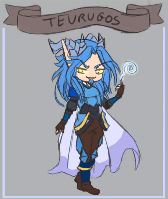
Class SwapSwapped Rhemuhas with Sae’tvean’s class because I love edgy boys. What if Draenei demon hunters who use void instead of fel tho? WHAT IF!? This is a pretty rough one since I am so behind on draecember already
alexrendesigns: Draecember day 2Class Swap Swapped Rhemuhas with Sae’tvean’s class because I love edgy boys. What if Draenei demon hunters who use void instead of fel tho? WHAT IF!? This is a pretty rough one since I am so behind on draecember already
if the horde gets a black dragon the alliance needs one
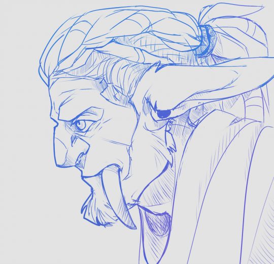
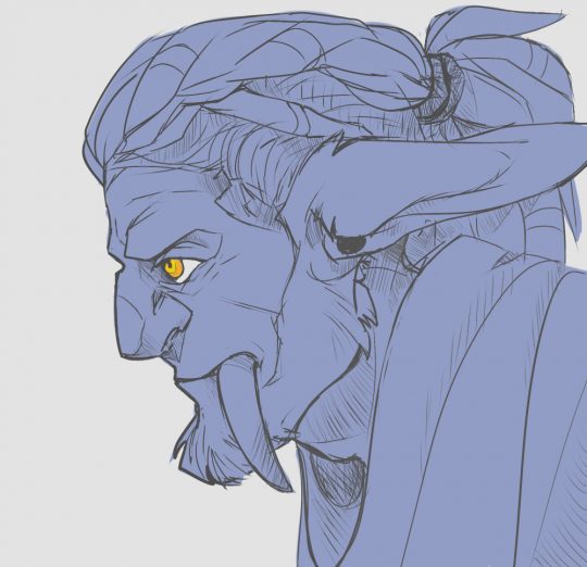
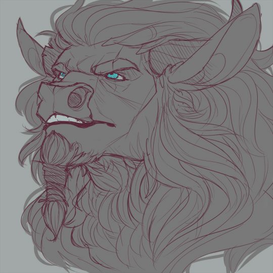
clockworkpriest: HEY SO I’m going to be trying out gold commissions again for World of Warcraft. I’ll only be doing one type of commission, which are these bust sketches you see above. They’re a flat rate of 150k, which is a little bit less than the conversion rate between
HEY SO I’m going to be trying out gold commissions again for World of Warcraft. I’ll only be doing one type of commission, which are these bust sketches you see above. They’re a flat rate of 150k, which is a little bit less than the conversion rate between actual money and wow tokens (currently ((in the us)) tokens are roughly 170k for 15 dollars’ worth of bnet balance). I normally charge 15 dollars for my regular bust commissions, so the conversion works out in your favor.
These are different from the sketches that I regularly offer in my normal commissions. I spend more time on these, for one. A minimum of 45 minutes goes into each picture, and I add color to the lineart to help make your character pop a bit more.
You also have the option to fill in the lineart with a solid color, and I’ll add your character’s eye color for you instead, like the bottom two images.
Other details:
-I prefer payments be made Alliance-side, however I will also take payments Horde-side!
-Because of the nature of these commissions, payment will be needed upfront, and once I start working on your picture, I will not be able to refund you (barring extreme circumstances).
-If you have any questions, you can email me or send me a message via tumblr.If you’re interested, please send me an email at clockworkpriest @ gmail . com (without the spaces). I’ll be opening three commission slots to begin with. Thank you!
everyone who died at the battle of hogwarts missed All Star by Smash Mouth’s release two days later
It’s so tragic, they still had so much to do, so much to see
Hey thanks for posting that thing about receipts and making gaslight victims feel even shittier for keeping them.
Considering you said they were keeping receipts and not being busted by them, I’m pretty sure they’re not the people the post is talking about!
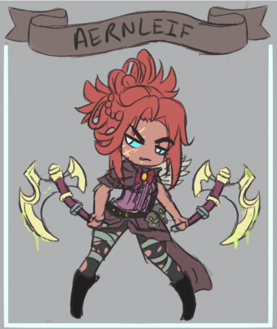
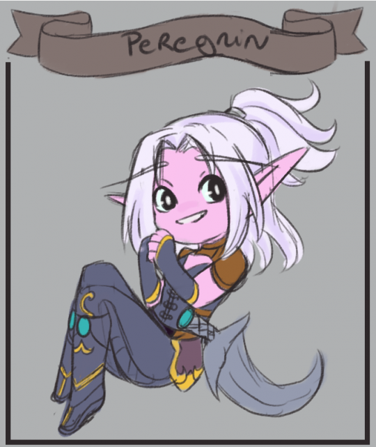
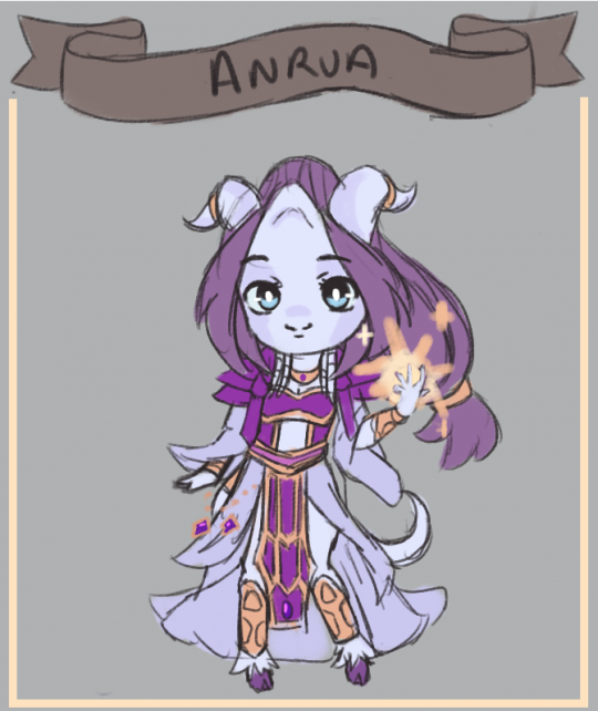
spicyheza:Some Twitter giveaway winner (for @tevruden and @drew-winchester). I wanted to draw @omoshiro-i ‘s Aernleif as an idol since this morning , and wanted to try @meadowlarking ‘s cutie draenei. All the sketch are going to be incoming keychain for new years.
Some Twitter giveaway winner (for @tevruden and @drew-winchester). I wanted to draw @omoshiro-i ‘s Aernleif as an idol since this morning , and wanted to try @meadowlarking ‘s cutie draenei.
All the sketch are going to be incoming keychain for new years.
artist tips
don’t save as jpeg
as a former yearbook editor and designer, let me explain this further
if youre only planning on posting your art online, them please save it as .png ;this is also better for transparencies as well
BUT
please, if youre planning of printing your art, NEVER use png. it makes the quality of the image pretty shitty. use jpeg or pdf instead. and always set your work at 300dpi to get a better printing quality – this means, the images are crisper and sharper and theres no slight blurriness. i had a talk with my friend who is currently taking design, and pdf is much better to use when youre working with a bigger publishing company because it still has the layers intact, but if youre only planning on printing your stuff at staples or at some small publishing store, the jpeg is the way to go.
this has been a public service announcement
I’ve replied to this once before but I see it’s doing the rounds again.
This is all utter bullshit.
I’m sorry but if your qualification is working on the school yearbook, you have no qualifications. Do not pretend otherwise. As a former professional photo manipulator for advertising brochures, I can say that you’re not comparing apples to oranges here – if anything, you’re comparing fruit to farmyard machinery:
- JPEG is a lossy format. It is suitable for web imagery because it sacrifices detail for reduced file sizes, but in doing so it introduces artifacts that weren’t in the original; if you load a JPEG for editing, then save it as a different JPEG, then you’re adding more artifacts formed from those first artifacts. Do this often enough and you end up with a horrid glitchy mess that looks like a puddle’s reflection after a stone’s been thrown in. You’ve seen those memes that have 3 or 4 different “found at” tags along the bottom, that look like fingerpainted copies of the original? That’s why.
- PNG is a lossless format that comes in two primary flavours, PNG-8 and PNG-24, which use 8 and 24 bit colour respectively. 8-bit colour is what you have in GIFs, a limit of just 256 different colours in a predetermined palette, usually automatically chosen by your software when saving. These files will look the same as GIFs, potentially with large patches of solid colour instead of the usual gradual shading seen in 24-bit imagery. This is usually better for small banners or pixel art, as it can yield smaller filesizes than GIF format. (There is an animated version called MNG but it has very little web support, hence the continued use of GIFs.)
- PNG-24 is great for larger images where detail is as important as colour depth, as well as printable RGB images and (if supported by the client) full colour images with gradient transparencies. It most certainly does not make “the quality of the image pretty shitty,” as it preserves every nuance. File sizes can be smaller than JPEG for small images, or significantly larger for large images.
- PDF is a container file, whatever you put into it will be pretty much preserved as it was, so you gain nothing but lose nothing.
- TIFF is what you need to be using for archival or print-quality imagery. It has support for multiple layers, multiple colour channels (RGB as well as CMYK, which is essential for accurate print rendering), and everything is preserved exactly as it was seen on-screen when being composed. There are compressed versions available, they use similar methods to PNG in order to maintain detail without sacrifice; next to whatever your graphics program uses natively, this is the most interchangeable format available for professional use.
- DPI is important only when used in combination with image dimensions; in and of itself it serves no purpose. If you make a brilliantly detailed 640×480 image & set it to 300dpi, you’ll receive a brilliantly detailed 2 inch x 1.6 inch print. This is great if you want to make a postage stamp, but not if you’re creating an A4 flyer! Determine the image’s dimension then set the DPI accordingly; 72dpi isn’t hideous especially for text-heavy work (it’s ~3 pixels per millimeter), and 150dpi can be suitable for many images. Unless you’re interested in photo realism, 300dpi is usually overkill – for our hypothetical A4 flyer, you’d need a file of 2490×3510 pixels for edge to edge printing, with a correspondingly high memory requirement and filesize even if using a compressed format.
- Keeping the layers intact is utterly unimportant for print work unless you want to use a separated colour print method that requires multiple passes to lay down each ink. If you send a file with all the layers, masks, etc. off for printing you’re liable to get it sent back unactioned, as they won’t want to take responsibility for choosing the wrong elements for printing. Save your work with everything intact, then save a flattened copy especially for printing purposes – this is one of the reasons Save Copy As… is a common option in graphics manipulation software.
This has been a Public Service Rebuttal.
Reblogging just because I read that first one when it was going around yesterday I was thinking “Thats utter horseshit but I don’t know my stuff well enough to articulate why” so THANK YOU.
For more about maximising print quality See Also: Pantone swatches, Vectors, Calibration and Proofs.
holy shit posting this here because i had no idea there was an actual difference
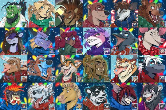
treatscraft: Holiday icons open! $35 each – turnaround time roughly a week – any species/humanoid welcome! Fill the form here for one: tinyurl.com/treatsholidayicons
Holiday icons open!
$35 each – turnaround time roughly a week – any species/humanoid welcome!
Fill the form here for one: tinyurl.com/treatsholidayicons
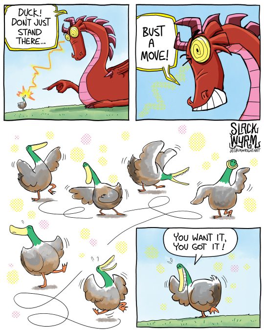
joshua-wright: A few internet killjoys complained the last comic was too silly, so rather than become disheartened, I decided to make this one even sillier ;P
A few internet killjoys complained the last comic was too silly, so rather than become disheartened, I decided to make this one even sillier ;P
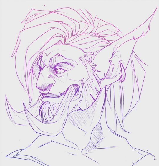
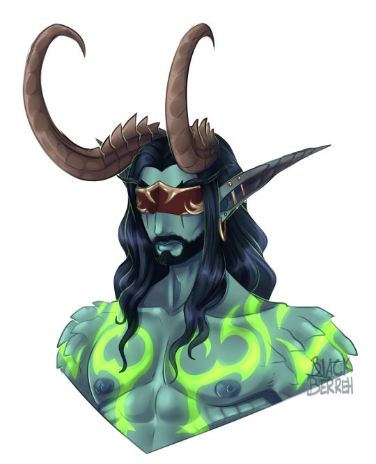
blackberreh-art:A messy sketch of my Demon Hunter Kali;; I decided to take an evening for myself and just doodle what I want; I really wanted to get him down and he was really fun to draw! Tomorrow it will be back to commissions!
A messy sketch of my Demon Hunter Kali;; I decided to take an evening for myself and just doodle what I want; I really wanted to get him down and he was really fun to draw! Tomorrow it will be back to commissions!
