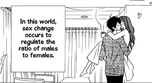
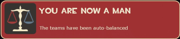
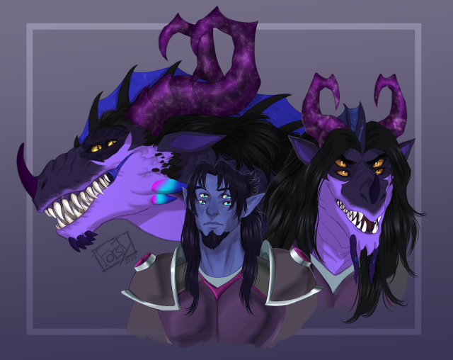
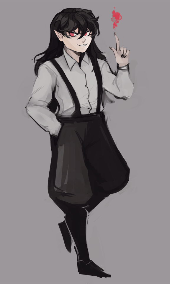
This Tuesday, Tevruden is contemplating how long its going to take for him to get his armor repaired, and what excuse to give the Royal Armorsmith after this picture.
If that weredragon transformation didn’t ruin it, the dragon one did.
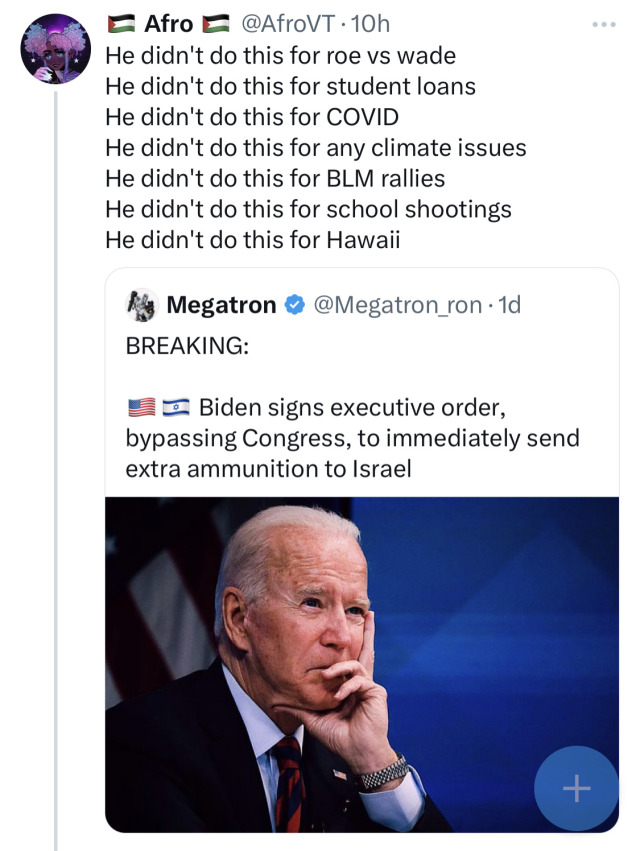
listen fuck biden i hate him too but he DID sign executive orders for all this and they are really really easy to look up
roe v wade (abortion access) – july 2022
student loan debt – august 2022 (he also cancelled another 5Billion dollars in student loan debt literally two days ago, jan 19 2024)
COVID – at least fucking TEN of them, within his first TWO DAYS of being in office, including vaccination mandates and improvement for the supply chain of manufacturing masks and other PPE
climate issues – literally the first day of his presidency
BLM – also literally the first day of his presidency
school shootings – march 2023
hawaii – august 2023
the tweet is, at best, someone who didn’t do research and at worst it’s inflammatory misinfo designed to demoralize
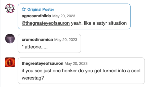
yeah your boyfriend’s a stag now. yeah he accidentally saw diana bathing and she turned him into an animal so he can’t tell anyone what he’s seen. he’s still the same guy mentally though. oh look his dogs are running up to him. maybe they’ll recognize him that’ll make him feel better
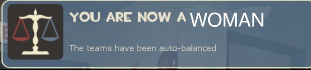
This is an experiment to see if there really are as few of us as people think.You can also use this to freak out your followers who think you’re 25 or something. Yay!
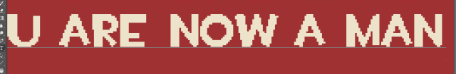
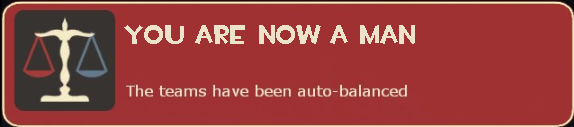
Oh no the „MAN“ is literally one pixel too low and now I can’t unsee it
TL;DR: what we’re dealing with is a font that tries to be inconsistent on purpose to give it an informal feel, but this bites us with some texts.
This text is a single text layer (obviously doing so for consistency)
so what we’re not dealing with is not editing failure, and instead something a bit more nastier.
Because the fonts are fairly detailed and we have to fit quite a lot of detail in a small area, usually anti-aliasing is done, because without it, we end up with something like this:
which results in these jagged lines which don’t look particularly appealing, and for smaller font sizes, readability is harmed significantly.
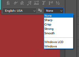
Photoshop in particular controls anti-aliasing method in this dropdown:
and my usual approach uses the “Smooth” method which from my experiments in an unrelated area (manga scanlation typesetting) happens to provide nice results, which is why I rarely bother changing it.
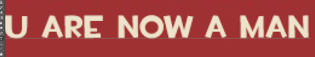
As we can see some pixels now go beyond the baseline in places where the font actually touches it. The effect was exacerbated because I added additional blur to match the text that was on the original image that I took the sign from.
Using the “Sharp” anti-aliasing method seems to strike a nice compromise, although we would have to see it zoomed out first.
And so we have the three extra images:
Smooth (basically the same as in the previous post, except I did not add an additional blur)
Sharp
None
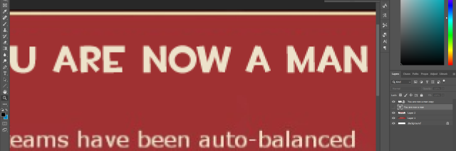
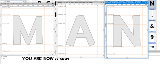
…but the jump still seems to be visible, so this is not just anti-aliasing in effect, but there’s more, so I opened up High-Logic Font Creator and opened the font in question.
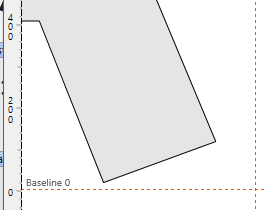
And we can see that the right-most side of letter “A” is significantly higher than the font baseline, and meanwhile
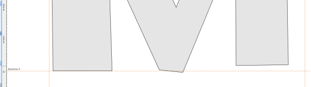
the left-most side “M” touches it at all points, the central part goes lower than the baseline, and the right-most side is slightly above it.
The distance combined with anti-aliasing woes is significant enough to register as one pixel difference, so what I’m gonna do is manually compensate for it, by moving the letter “M” and “N” slightly up.
(original)
(compensated, value picked experimentally)
I think it’s slightly better now, although at this point it’s hard for me to judge (been staring at it too hard).
I always reblog for someone caring too much about fonts. Welcome to my pain.
Fonts: the cause of and solution to all our life’s problems
ALT