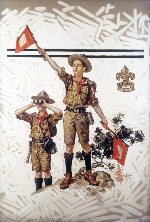
goddamnshinyrock: Someone in the notes of the last Leyendecker post I reblogged mentioned having difficulty telling his work and Rockwell’s apart, and I know from experience that many people get them confused, which is somewhat astonishing as, to my eyes, their styles are very
Someone in the notes of the last Leyendecker post I reblogged mentioned having difficulty telling his work and Rockwell’s apart, and I know from experience that many people get them confused, which is somewhat astonishing as, to my eyes, their styles are very distinct. Leyendecker was Rockwell’s idol and mentor, but they were very different people and were interested in portraying different aspects of humanity, even when the basic subject matter was the same.
Surface-level, here are some differences:
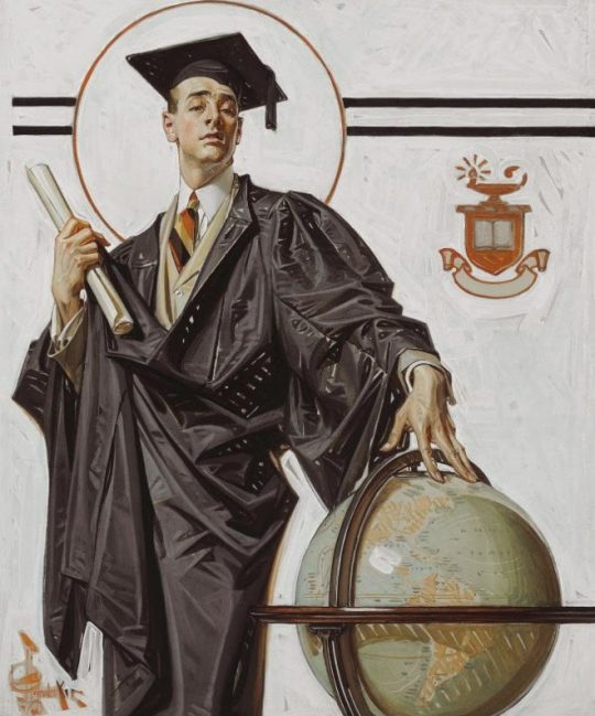
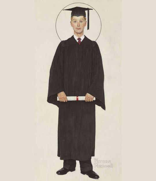
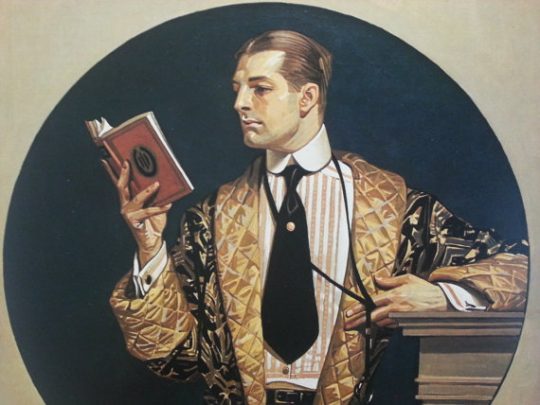
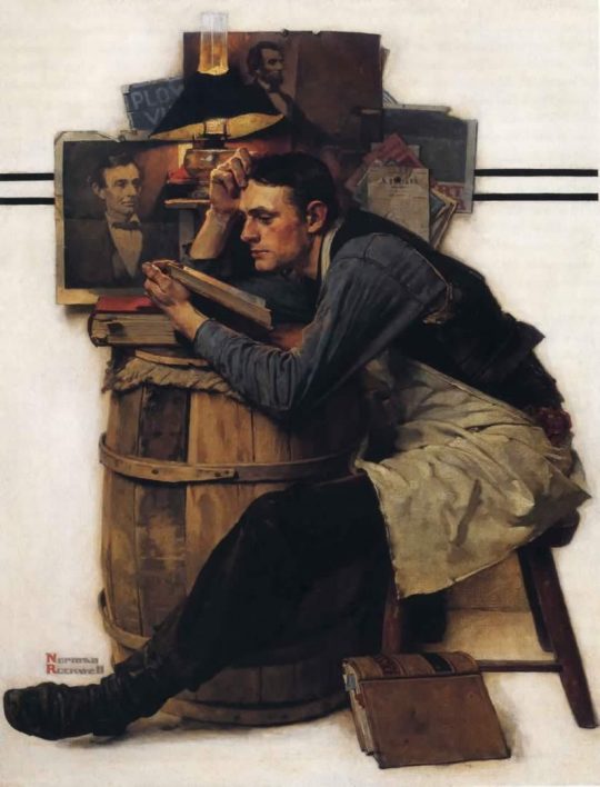
Leyendecker smoothed out faults and imperfections (in the young. he stylized them in the old); Rockwell exaggerated them to mild or moderate caricature
Leyendecker approached his paintings as sculpture- even the merest clothing folds are carved out of the paint; Rockwell approached his paintings as drawings- the underlying contour always shines through.
Leyendecker used broad hatching brushstrokes and areas of smooth shine; Rockwell used more naturalistic texture and lighting
Leyendecker created idolized, larger-than-life figures that feel Hellenistic in their perfection; Rockwell created intimate scenes populated by figures that feel familiar in their specificity
Leyendecker’s best and most comfortable work was as a fashion/lifestyle illustrator; Rockwell’s best and most comfortable work was as an editorial/humor illustrator
Leyendecker created beautiful still lives with his figures; Rockwell told compelling stories
Leyendecker often created erotic tension in his paintings; Rockwell almost never did.
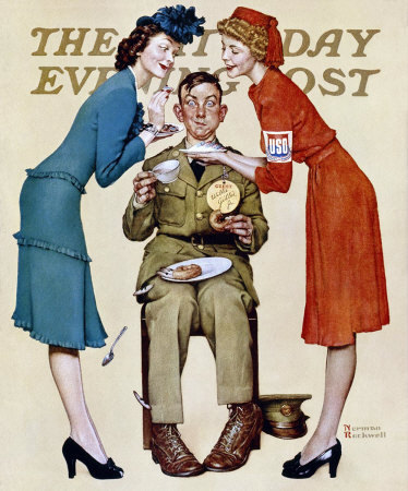
See below: Two paintings of soldiers with women, but in Rockwell’s there is a clear punchline, and while the poses are contrived for the sake of composition, they’re not self-conscious. The women are pretty- as demanded by the central joke- but not truly sexualized anywhere but in the mind of the young soldier who is being overloaded with cake and attention.
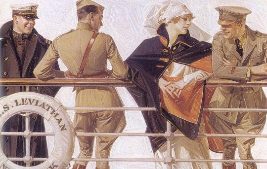
Contrast Leyendecker’s soldiers with a young nurse. Everyone in this image is posing attractively- no one has their mouth full or ears sticking out. Each crease and fold is sharp and sculptural, and the light picks out their best features- in particular the shoulders and posterior of the soldier facing away from the viewer. There is neither joke nor story, merely a group of beautiful young people, portrayed with deft brushwork and graceful lines. (and check out that hatching! That’s indicator #1 that you’ve got a Leyendecker image)
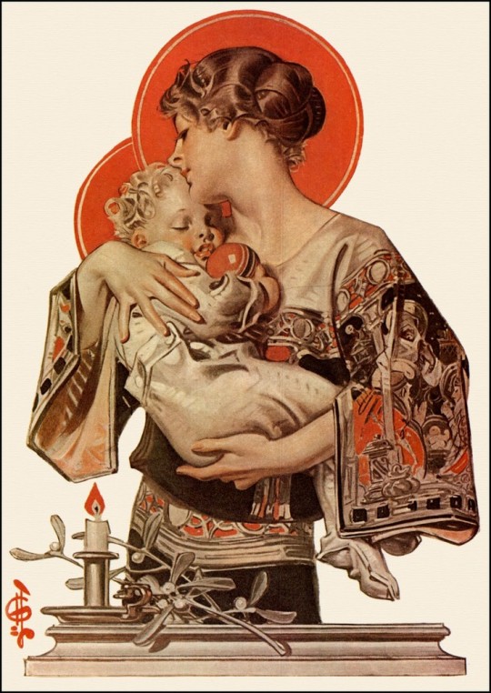
Leyendecker was very comfortable with “hot young things wearing clothes”, and did them very VERY well, but his facility with idealization came at the cost of personalization, which was fine for fashion illustration, but shows in his domestic scenes:
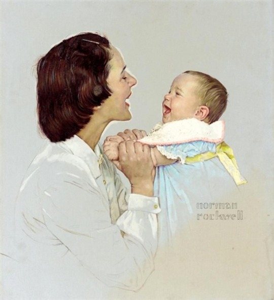
Beautiful, but… cold. (Also, that hand on the left- who holds a baby with their hand like that??? Good lord, J.C.) Compare a Rockwell illustration (for a baby food brand, I believe) of a mother and baby: this is clearly a real and individual young mother and baby, interacting exactly how parents and babies really interact.
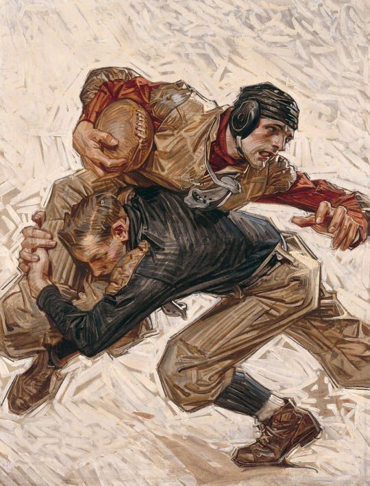
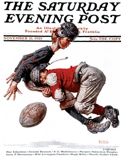
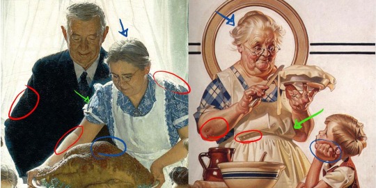
Even when they did basically the same content, and putting aside posing or composition or anything other than objective visual analysis, it’s still obvious who is who:
Red: NR’s smoother rendering vs JCL’s super cool hatching
Green: NR’s naturalistic cloth folds vs JCL’s sculptural stylization
Blue: NR’s natural lighting vs JCL’s world where everything is shiny
Now go forth, confident in the knowledge that you’ll never confuse a Rockwell or a Leyendecker ever again, and can refute any claim that their styles are ‘virtually identical’.