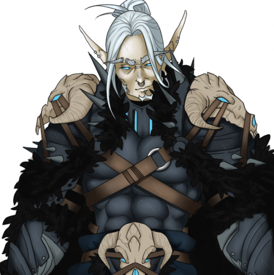
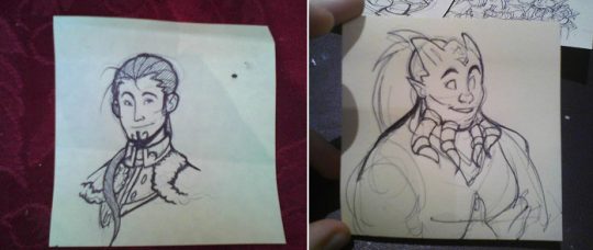
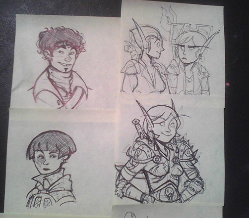
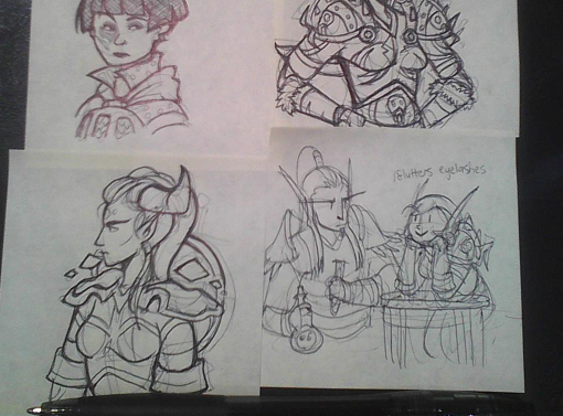
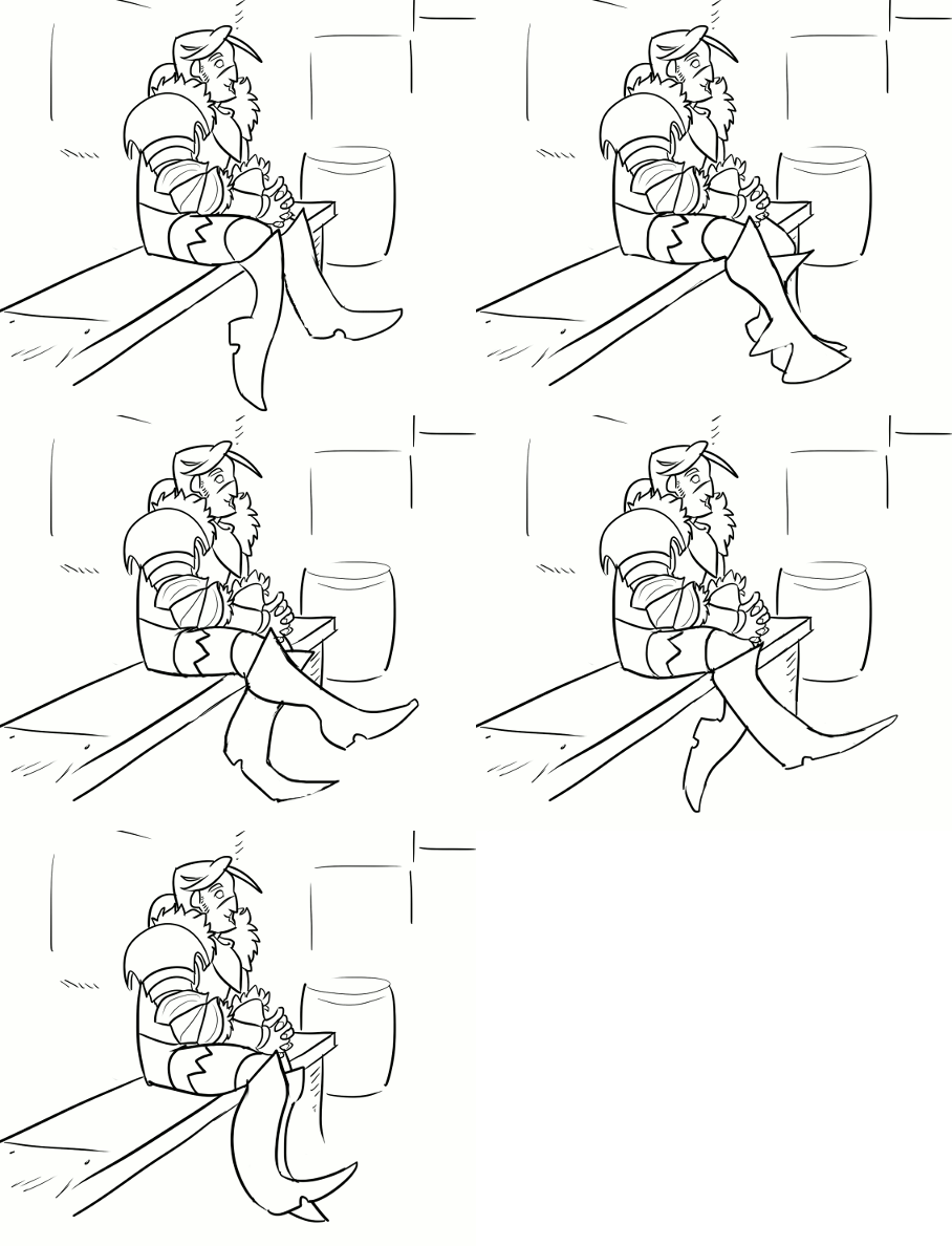
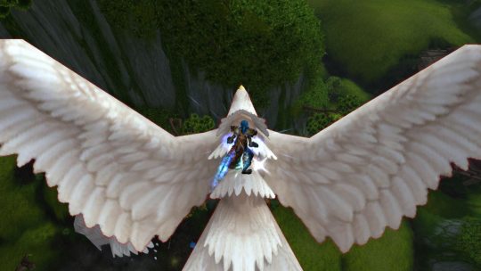
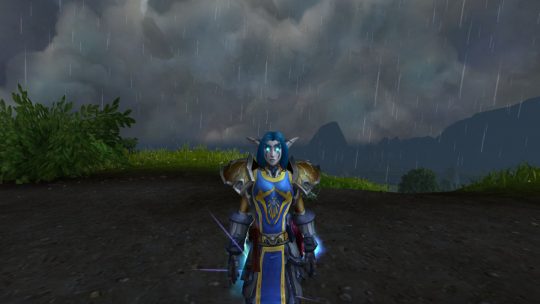
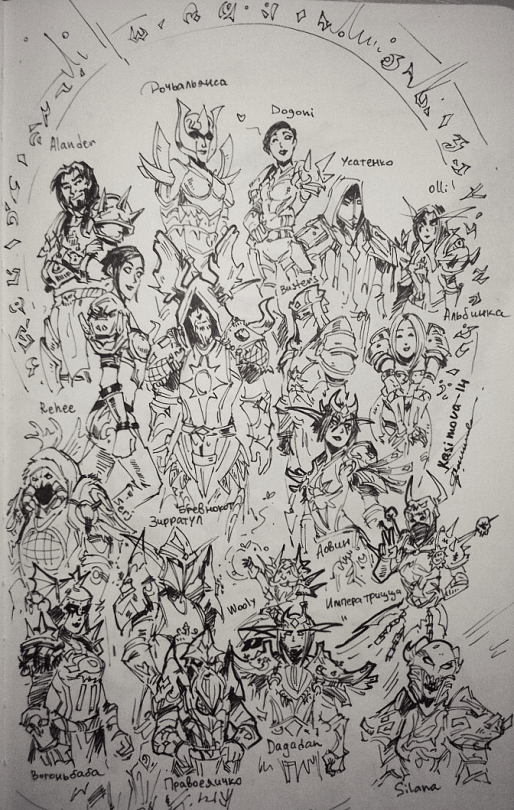
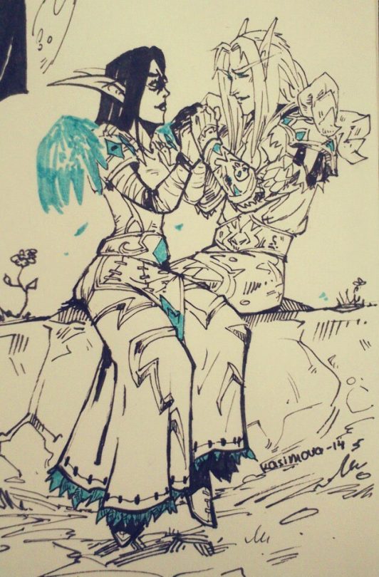
finally finished this stupid piece of crap’s armor
my hand is ded
icyvveins: finally finished this stupid piece of crap’s armor my hand is ded fullsize here
lambylingames: custom pc hell
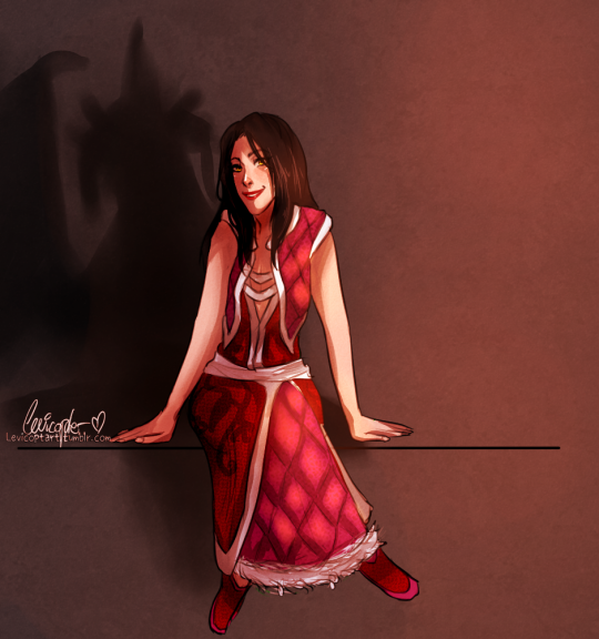
levicoptart: Look, it’s the big, bad, dragon lady
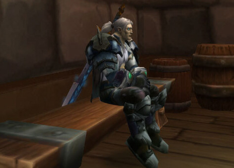
shithowdy: i’m not tall enough for my garrison benches and it’s adorable
reblog if you LIKE ocs, HAVE an oc or ENJOY HIDING DUCKS IN PEOPLES BATHROOMS
Comic panel structure for the enthusiast
So you wanna do a comic and you have the passion and determination to do it and you have read thousands of comics, but when you deal with a blank page you are kinda lost… You already have your script and more or less have an idea of what to do, but how to construct it? are there rules? nobody talks about this… maybe I should just start and assume it will be fine….
WAIT THERE!
LET ME HELP YOU.
There are several “rules” that nobody say, mostly because professional artists are not really that talkative and they’re a bit jealous of these “secrets”, they are no secrets but basic steps to follow. So let’s review the most important ones.
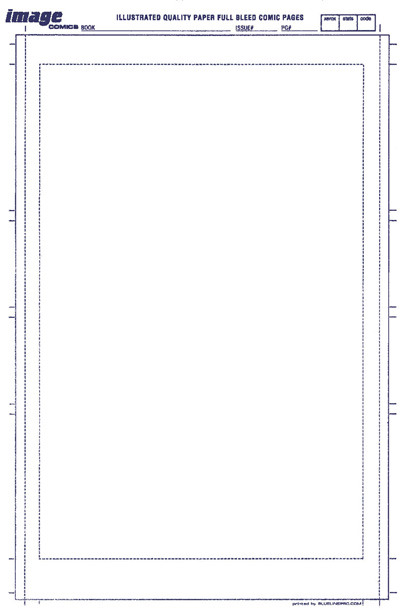
- Comic pages are 11’ x 17’ vertical with a bleed margin of something like 1’ and 1.5’ for the top margin depending on how you wanna work (this is for printed works web comics are flexible)
- Pages in a regular comic contain from 4-8 panels in it, depending, but this is the average number. Must of your pages must be in between these numbers otherwise you’re showing too little or overwhelming the readers.
- ALL pages must have in at least ONE panel with the main character in full body view, once he/she/it has been introduced. this is to remind the reader of how they look.
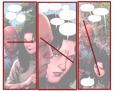
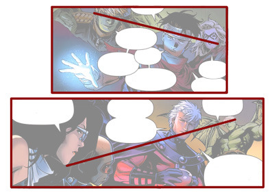
- When the characters are talking in a panel, even when they’re more than two, they must follow a visual line, as the line gets more vertical this makes the panel more dynamic
- Now that you know that play with the visual lines don’t repeat them in the same page.
- Always show the character from different angles in the same page.
- Panels with zoom in images must be very detailed, and you must be able to tell what the zoom in object is, unless it is your intention not to to uncover it until later in the story.
- On EACH PAGE there must be a visual sense of environment, meaning draw a background for each page AND ground the characters to it.
- There must ALWAYS be one panel that is the focal point of the page, that panel you are drawn to immediately when you first see the page.
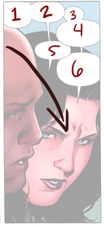
- ALWAYS draw and structure your panels with the idea that the readers are the MOST STUPID PEOPLE EVER (sounds mean but it’s true). Everything must be 10000000% clear, for when they read the page EVERYTHING will be understandable. In this part comes the speech bubbles. Force the reader to make them read the way you want them to, try not to confuse them.
- Use a clear font to read… BUT PLEASE DON’T USE COMIC SANS! I will come for you at night and pull your feet if you do!
- Always leave space for speech bubbles in your panels,or be ready to crop some of the drawing.
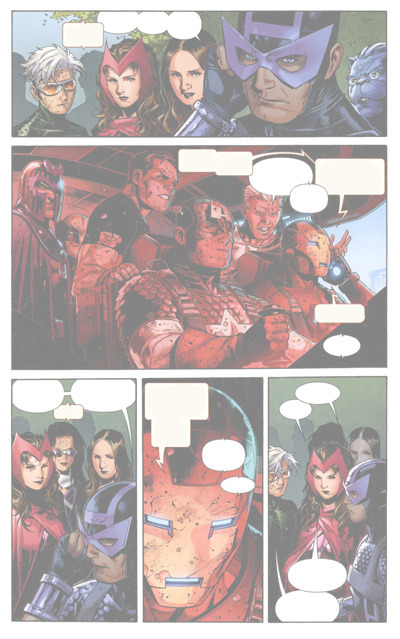
- Some artist can manage panels magnificently, even artistically, but if this is not you, don’t be afraid to use simple squares all the time! This is Jimmy Cheung, one of Marvel’s best and he always uses simple paneling so don’t be afraid
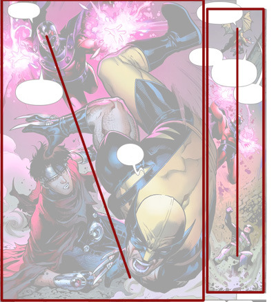
- For panels with dynamic actions do everything with an inclination
…
I think that’s the basics of paneling. If you have any other questions don’t hesitate to ask.
support asexuals
>sex repulsed asexuals
>aromantic asexuals
>asexuals who are not intimate people in general
>asexuals who wear lots of layers that cover their bodies
>asexuals with sex drives
>asexuals who masturbate
>asexuals who are “broken”
>asexuals who make and laugh at sexual jokes
>asexuals who wear “revealing” clothing
>who are romantic
>who arent sure if they will always consider themselves asexual
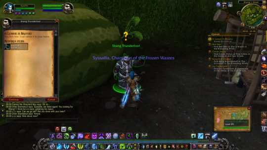
illidarilordofanime: A moment where my death knight contemplated punching someone
- “Sir I was murdered and turned into a killing machine. I’ve seen worse than a giant bird.”
A moment where my death knight contemplated punching someone
