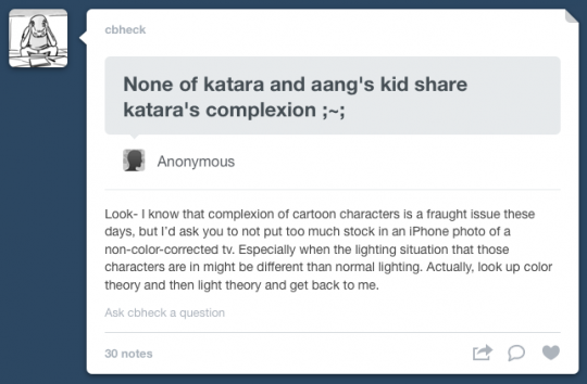
This past Friday I published this post which featured a photo of a monitor showing Katara and Aang’s grown-up children, Bumi, Kya, and Tenzin. Later that night at work I saw Colin’s answer to an anonymous “ask" (I can’t figure out how to link or reblog it properly in my browser, so the screen shot at the top will have to suffice). It is a shame the anonymous asker drew an incorrect assumption based on one image created in relatively uncontrolled conditions, and I feel that Colin’s answer hit the nail on the head.
Normally I would leave it at that. I prefer to stay out of this type of discourse on Tumblr and let the large body of work Mike and I have put out there over the years speak for itself (which obviously DOES NOT include the gross misinterpretations and misrepresentations of our work in this guy’s work). There’s nothing perfect about me or my work, but I am proud of it and the diverse, inclusive, atypical-for-American-TV world it portrays and the characters that populate it, and what it means to many people all over this globe.
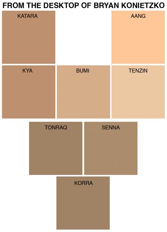
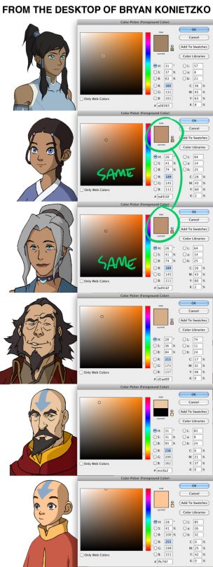
But, like most people, I don’t like seeing the spreading of misinformation, nor being falsely accused of something, nor fans of Avatar and Korra believing we have let them down regarding a very sensitive issue when they are mistaken. The claim that “none of Katara and Aang’s kids share Katara’s complexion" is unequivocally false. Kya’s color model shares the exact same skin color as Katara’s; Tenzin’s skin is a touch darker and less saturated than Aang’s; and Bumi’s is just about in the middle of his siblings’. I made a color swatch chart above, with all the colors taken directly from the characters’ normal color models. I included Korra’s and her parents’ skin tones on there as well, just for reference. I also compiled screen shots of all the characters with the color picker open, sampling their skin tones. You can see for yourself that Katara and her daughter Kya share the same color code: #bd916f
Depicting diverse characters is an issue that is very important to me. But as an art director, depicting a variety of lighting situations, light temperatures, colored light sources, color atmospheres, contrast levels, dynamic ranges, tinted filters, tones, styles, moods, exposure settings, diffusion levels, etc., is all very important to me too, all in an attempt to make great, inspired, sophisticated, beautiful art that reflects something of the complex world in which we live.
Real flesh and blood skin is shiny in places, matte in others, translucent, reflective, uneven, smooth in places, textured in others. It reacts to light and color in such complex ways that while most people rarely even think about it in our normal day experiences, the properties are so intricate and subtle that mastering its accurate representation eludes students of painting such as myself for years on end. On the other hand, 2D cartoon character skin is a flat field of projected or printed color. It is an abstracted, simplified representation. If one adds lighting to a 2D animated character, that whole color field of skin tone is lightened––uniformly, unless you apply a the few limited techniques at our disposal in TV animation involving gradations. If one adds lighting to real flesh and blood skin, highlights and core shadows are formed, light models surfaces and bounces onto others, colors are reflected from surrounding objects… on and on. 3D animation certainly has many more tools at its disposal to depict skin in a realistic fashion, but even that isn’t a cakewalk and many attempts plummet into the uncanny valley.
As Colin made reference to, color theory is an incredibly fascinating, frustrating, and bewildering pursuit. I’ve been studying and trying to apply it for twenty years, and I’m still in its awe. There are so many factors to consider before trusting your own perception. For example, in the image above with the characters’ heads, Kya’s skin appears to my eye to be slightly lighter than Katara’s, despite the fact that I know they are absolutely the same color. This is most likely due to the effect of simultaneous contrast, also known as contrast effect: in simple terms, colors are pushed lighter, darker, warmer, and cooler based on what other colors are next to them. I’ve taken a sample of Korra’s normal skin tone and applied it to an illustration with a painted background and all of a sudden it looks green. On another background it might appear gray. Or bright orange. The average 2D animated show out there in the world has stock normal color models for its characters that they use for almost every scene (occasionally with a “night" version that is a bit darker and cooler). Typically the character models are presented in a vacuum, with no change in lighting, atmosphere, contrast, etc… no regard for any of the artistic properties mentioned above that I am trying to utilize in my animation art direction.
I’m not going to make that kind of show. Instead, I’m going to add lighting, change contrast levels, mix up the colors of light sources, try to inject some atmosphere into the world we’re creating. And as a result, characters’ skin tones are going to appear different depending on the context of the scene. The colors on a normal color model sheet are what’s called local color in color theory. This is the color of an object in neutral, even light. But it’s just a starting point, a flat color field in a vacuum. On Avatar we dialed every single color model from its normal model to match the lighting and color atmosphere of the background painting for each sequence in all sixty-one episodes. On Korra we do that too, and take it many steps further by adding lighting and atmosphere effects in the compositing stage, all in a pursuit of a dramatic, cinematic aesthetic. Sometimes it works out and I’m satisfied with the results. Sometimes the effects are too heavy-handed and even I’m saying, “His/her skin looks too light!“ Unfortunately, this is a TV show production where we are frantically making dozens of episodes at once and we don’t get to finesse the final composites like they are able to do in feature productions. I fix what I can in retakes and color correction, but there’s only so much I can do. But I’d rather have a few fumbles in the pursuit of good art than make a flat show with no lighting or atmosphere.
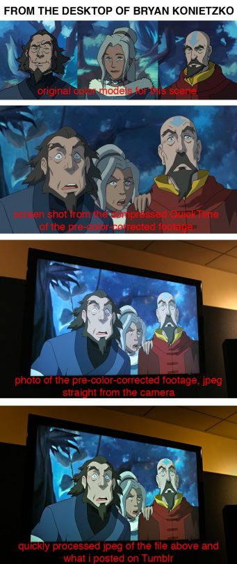
And I enjoy sharing sneak peeks of the work we’re making with you guys, which often means I take a snapshot on my iPhone or DSLR of a screen and post it on Tumblr. Take a look at the last compilation of images above to see how differently colors, particularly skin tones, can vary depending on their sources. This opens up another vastly complex subject of which I am a frustrated student: photography. Take color theory and multiply it by optical engineering and then by computer science and then pull all of your hair out as you try to get your meticulously processed photo to appear the same color and contrast level on a variety of digital devices and non-color-managed web browsers and non-color-calibrated monitors. Or try the simpler task of taking a picture of something on a TV screen and see how different the photo looks than the image you saw. Everything goes out the window. While you’re at it, take digital pictures of the same red apple at different times of day, in different rooms, under different lights, outside in different weather. Then pull all of those photos into your computer and make color swatches of what you thought you knew to be “red.” Then try painting a picture of that apple using just those sampled color swatches. You’ll start to see how complex this all is.
I am all for social justice and breaking down ignorance and oppressive, hurtful social constructs, particularly when the path to that is to inform, educate, open minds, and promote empathy and equality. I am not a fan of self-righteousness in any form and I struggle to keep from drifting in that direction with my own views and convictions. The internet provides a great platform to call BS on a lot of things, and I encourage people to use it for that. But now that you have the official local color swatches of these characters’ “normal" skin tones in the image above, I can assure you that using it like some Behr color chip ammunition to lambast every fanart depiction of Korra that doesn’t match #a08365 is a flawed pursuit. Ask yourself if any of the things listed above in this post might be factoring into a color variation before you shoot from the hip with your judgement. And if the depiction of Korra in some fanart is without a doubt offensive to you, consider phrasing your response in a way that could help them see it your way. Art is hard! Maybe he or she is trying to get the hang of painting and working with color (skin being one of the hardest things to master). Maybe he or she is still ignorant to the worldly views that are obvious and significant to you. You could take this opportunity to turn it into what they call in parenting “a teaching moment.“ You could open some eyes and educate someone who might turn around and share their enlightenment with many others.
I haven’t even scratched the surface of all there is to discuss on this topic in this overlong post. But I urge you to consider any number of the factors listed and described above before you jump to false conclusions, get your feelings hurt, or lash out with self-righteous condemnation based on a variable rather than a constant.
Love, Bryan
*Drops microphone*


